Building a stunning table of contents that follows headings
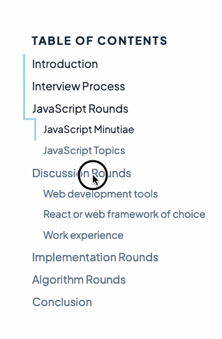
When I first came upon Hakim El Hattab’s progress nav demo, I knew I had to implement it. It was one of those few instances where animation added so much more to the user experience. For those on smaller viewports, this is what my version looks like:
In this tutorial, we’ll cover all these concepts so you can too make your table of contents that amazes readers.
Basic markup
Let’s start off with the HTML and CSS that we will be working with throughout this tutorial:
<main>
  <div class="toc">
    <nav class="toc-nav">
      <h2>Table of Contents</h2>
      <a href="#title-1" class="toc-link">H1 Title</a>
      <a href="#title-2" class="toc-link">H2 Title</a>
      <a href="#title-3" class="toc-link toc-link-depth__1">H3 Title</a>
      <a href="#title-4" class="toc-link toc-link-depth__2">H4 Title</a>
      <a href="#title-5" class="toc-link">Another H2 Title</a>
      <svg xmlns="http://www.w3.org/2000/svg" id="toc-svg">
        <path
          id="toc-svg-path"
          fill="transparent"
          stroke-width="2"
          stroke="black"
          stroke-linecap="round"
        ></path>
      </svg>
    </nav>
  </div>

  <article>
    <h1 id="title-1">H1 Title</h1>
    <p>...</p>
    <h2 id="title-2">H2 Title</h2>
    <p>...</p>
    <h3 id="title-3">H3 Title</h3>
    <p>...</p>
    <h4 id="title-4">H4 Title</h4>
    <p>...</p>
    <h2 id="title-5">Another H2 Title</h2>
    <p>...</p>
  </article>
</main>
.toc {
  position: sticky;
  top: 2rem;
  height: 100%;
  margin: 2rem;
}

.toc-nav {
  position: relative;
  display: flex;
  flex-direction: column;
}

.toc-link {
  margin: 0.375rem 0;
}

.toc-link-depth__1 {
  margin-left: 1rem;
}

.toc-link-depth__2 {
  margin-left: 2rem;
}

#toc-svg {
  position: absolute;
  top: 0;
  left: -1rem;
  height: 100%;
  width: 100%;
}
Building the SVG path
The base ingredient of this component is an SVG path that traces the left side of the table of content. As this cannot be done using existing CSS properties, we need to enlist the help of JavaScript.
To construct the SVG path, we need to know where to start and end each section of the path. To achieve this, we need to find out the position and dimensions of each link relative to the table of contents.
Since we have added the class toc-link to each of our links, we can read their values like so:
const tocLinks = Array.from(document.getElementsByClassName('toc-link'));
tocLinks.forEach((tocLink) => {
  const computedStyle = window.getComputedStyle(tocLink);
  const marginTop = parseInt(computedStyle.marginTop, 10);
  const marginBottom = parseInt(computedStyle.marginBottom, 10);
  console.log({
    x: tocLink.offsetLeft,
    y: tocLink.offsetTop - marginTop,
    height: tocLink.offsetHeight + marginTop + marginBottom,
  });
});
Now that we have their values, we can start to construct the path. An SVG <path> requires the property d, which contains instructions on how to draw itself. There are many instruction types, but we will be only using these 3 in this tutorial:
M <x> <y>: Indicates the start of a strokeV <y>: Draws a straight vertical stroke until it reaches the y coordinateH <x>: Draws a straight horizontal stroke until it reaches the x coordinate
For example, <path stroke-width="1" fill="transparent" stroke="red" d="M 0 0 V 30 H 30 V 0 H 0"></path> will draw a red square, albeit with top and left edges clipped:
This is because svg path strokes are filled from the middle, causing half of the stroke to be outside our defined viewport. The easiest fix for this unfortunate implementation detail is to add an offset, like so: <path stroke-width="1" fill="transparent" stroke="red" d="M 5 5 V 35 H 35 V 5 H 5"></path>
Using the three instructions above, we will trace our table of contents by keeping track of the left offset and drawing additional horizontal lines whenever the left offsets differ:
function buildPath(tocLinks, svgPath) {
  const pathOffset = parseFloat(svgPath.getAttribute('stroke-width'));
  const pathList = [];
  const anchorConfigs = [];

  let prevX;
  tocLinks.forEach((tocLink, i) => {
    const computedStyle = window.getComputedStyle(tocLink);
    const marginTop = parseFloat(computedStyle.marginTop);
    const marginBottom = parseFloat(computedStyle.marginBottom);

    const x = tocLink.offsetLeft + pathOffset;
    const y = tocLink.offsetTop - marginTop;
    const height = tocLink.offsetHeight + marginTop + marginBottom;
    const anchorConfig = {
      id: tocLink.href.slice(1),
    };

    if (i === 0) {
      pathList.push('M', x, y);
      anchorConfig.start = 0;
    } else {
      pathList.push('V', y);

      // Draw a horizontal line when there's a change in indent levels
      if (prevX !== x) {
        pathList.push('H', x);
      }

      // Set the current path so that we can measure it
      svgPath.setAttribute('d', pathList.join(' '));
      anchorConfig.start = svgPath.getTotalLength();
    }

    prevX = x;

    pathList.push('V', y + height);
    svgPath.setAttribute('d', pathList.join(' '));
    anchorConfig.end = svgPath.getTotalLength();
    anchorConfigs.push(anchorConfig);
  });

  return anchorConfigs;
}

const tocLinks = Array.from(document.getElementsByClassName('toc-link'));
const svgPath = document.getElementById('toc-svg-path');
const anchorConfigs = buildPath(tocLinks, svgPath);
With buildPath, we can finally build our path like so:
const svgPath = document.getElementById('toc-svg-path');
const pathStartAndEnds = buildPath(tocLinks, svgPath);
Which should construct a neat outline on our table of content.
Animating the path on scroll
Having our SVG path is only half the story, we still need to animate the headings as well as the path whenever we are scrolling through content. There are two approaches:
- Listen to the “onscroll” event and actively update the table of contents based on the scroll position
- Detect headings entering and leaving the viewport using IntersectionObserver
While the first approach handles the situation where users scroll upwards, it is much more computationally intensive and might result in janky animations due to frequent repainting. The second approach is much easier to write and more efficient, so that is what I have chosen to go with.
Using an IntersectionObserver, whenever a heading is leaving or entering the viewport, we will mark its respective anchor link as active or inactive. Using this list of active anchor links, we will mark the section of the path as visible using stroke-dasharray.
const pathLength = anchorConfigs[anchorConfigs.length - 1].end;

const observer = new IntersectionObserver((entries) => {
  let pathStart = pathLength;
  let pathEnd = 0;

  for (let i = 0; i < anchorConfigs.length; i++) {
    const anchorConfig = anchorConfigs[i];
    const entry = entries.find(({ target }) => target.id === anchorConfig.id);
    anchorConfig.isIntersecting = entry.isIntersecting;
    // Get start and end of the active anchors
    if (anchorConfig.isIntersecting) {
      pathStart = Math.min(anchorConfig.start, pathStart);
      pathEnd = Math.max(anchorConfig.end, pathEnd);
    }
  }

  // skip if no path is drawn
  if (pathStart === pathLength) return;

  svgPath.setAttribute(
    'stroke-dasharray',
    `1 ${pathStart} ${pathEnd - pathStart} ${pathLength}`,
  );
  // Avoid svg bug where stroke appears at the start on firefox
  svgPath.setAttribute('stroke-dashoffset', '1');
});

const headings = anchorConfigs.map(({ id }) => document.getElementById(id));
headings.forEach((heading) => observer.observe(heading));
This should make the path change as we scroll. We can improve the user experience by also styling the anchor links whenever they are active:
// skip if no path is drawn
if (pathStart === pathLength) return;

for (let i = 0; i < anchorConfigs.length; i++) {
  const { element, isIntersecting } = anchorConfigs[i];
  // toggle class only if path has changed (even if heading is out of view)
  element.classList.toggle('toc-link__active', isIntersecting);
}

svgPath.setAttribute(
  'stroke-dasharray',
  `1 ${pathStart} ${pathEnd - pathStart} ${pathLength}`,
);
That was a lot of JavaScript, but thankfully, we can leave the heavy lifting of animating the path and highlighting active anchors to CSS:
.toc-link__active {
  font-weight: bold;
}

#toc-svg-path {
  transition: all 0.3s;
}
Adding a gradient to the path
The implementation so far would achieve the same effect presented in Hakim’s initial demo page. However, to add additional flair, I wanted to make a gradient appear on the path which would gradually reveal different colors as the user scrolls. Unfortunately, SVG strokes can only be a solid color, and SVG fills do not work as our path is not a completed closed path.
With a help of a friend, we discovered that SVG masks could get us the desired effect. Svg masks, as the name implies, acts as a mask over another element. For example, drawing a circle in a mask over a red background would get us a red circle.
So to achieve a gradient path, this was what we did:
- Lay a rectangle that stretches across the entire SVG viewport
- Fill the rectangle with a gradient
- Introduce a mask that contains the path that we drew previously
In terms of code, this was what you need to replace the original svg with:
<svg xmlns="http://www.w3.org/2000/svg" id="toc-svg">
  <defs>
    <linearGradient id="gradient" x2="0" y2="100%">
      <stop offset="0%" stop-color="#81defd" />
      <stop offset="100%" stop-color="#ffb8d2" />
    </linearGradient>
    <mask id="mask" x="0" y="0">
      <path
        id="toc-svg-path"
        stroke-width="2"
        fill="transparent"
        stroke="white"
        stroke-linecap="round"
      />
    </mask>
  </defs>

  <rect width="100%" height="100%" fill="url(#gradient)" mask="url(#mask)" />
</svg>
And that was it! These few lines of HTML took me numerous hours to figure out, but I think it was all worth it.
Final words
Despite the complexity of this table of contents, I was glad I took the time to implement it. It taught me more about SVG paths, which are woefully underused, and I would like to see more components enhanced and driven by them in the future.
I hope this tutorial was useful in helping you implement an impressive table of content or navigation. I would love to see your creation on Twitter!